Cheers to all readers
the blog continues..
Google's Chrome 2.0: First Impressions:Chrome 2.0 promises to be a faster browser than its predecessor, but don't expect many new features.
Google Chrome is a browser whose only claim to fame (aside from being a Google product) is its speed and simplicity. In fact, some would claim that Chrome is simple to a fault, with version 1 of the browser lacking features that seem almost fundamental for a Web browser in 2009, such as form auto-fill, a full-screen mode, and extensions. With Chrome 2.0, Google has closed the gap a little bit, adding a full-screen mode, form auto-fill, and the ability to remove thumbnails from the “New Tab” page, along with a whole host of bug fixes and overall performance improvements.

Chrome 2.0 looks and acts exactly like the previous version; the new features are so subtle that without Google’s announcement, it’s likely they would have gone unnoticed by many of its users. Full-screen mode is easy enough to find; press F11 to invoke it, or select it from the wrench icon menu in the toolbar. But it’s also nearly useless--when in Full-screen mode, all of the browser controls disappear: no tabs, no toolbar, nothing. You can’t enter new addresses to visit. You can’t access your bookmarks, except from the Chrome start page. Everything must be done via keyboard shortcuts or the anemic right-click menu. Google says this mode is designed for viewing videos and presentations in full-screen, but any competent video or presentation player already provides full-screen support, so I have to wonder why this feature even exists in this state.
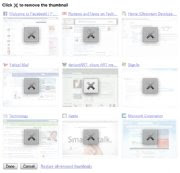
The other new features aren’t much better. Form auto-fill is a feature that other browsers have had for years. As you fill out a form field, Chrome will display possible choices below the field, and you can click to select one. It’s not pretty, it just works. The ability to delete thumbnails from the “New Tab” page is utilitarian at best. Click Remove Thumbnails, click the thumbnails you want to remove, and click Done. Oddly, if you have fewer than four thumbnails and you delete one, it will remove all of your thumbnails (this is presumably a bug). Also, you can't rearrange the thumbnails on the page. Both of these features seem so basic that it’s a wonder they weren’t there all along.
Where Chrome 2.0 shines is in its performance. It zips through the most complex Web applications with ease, and never seems to get bogged down. The browser is lightning fast, but then so was version 1.0, and while Google asserts that 2.0 is even faster and more stable, no one is going to notice the small increments in speed and stability.

Chrome is the Lamborghini of Web browsers. It’s built to be the fastest browser out there, and--like a Lamborghini--it does so by putting powerful technology under the hood and adding just enough on top to make it street-legal, but not much more. The regrettable car analogy aside, Chrome 2.0 maintains that reputation. It isn’t going to win any functionality awards or come out on top in feature comparisons, and the new stuff is completely unremarkable. But it will still get you to your favorite sites faster than anything else, and for existing Chrome users it’s worth downloading, if only to stay current. Newcomers to Chrome, however, will find it extremely lacking.

No comments:
Post a Comment
Thank you soo much for your comments..